Case study · Fruit juice
Logo, website and packaging for a fruit juice brand
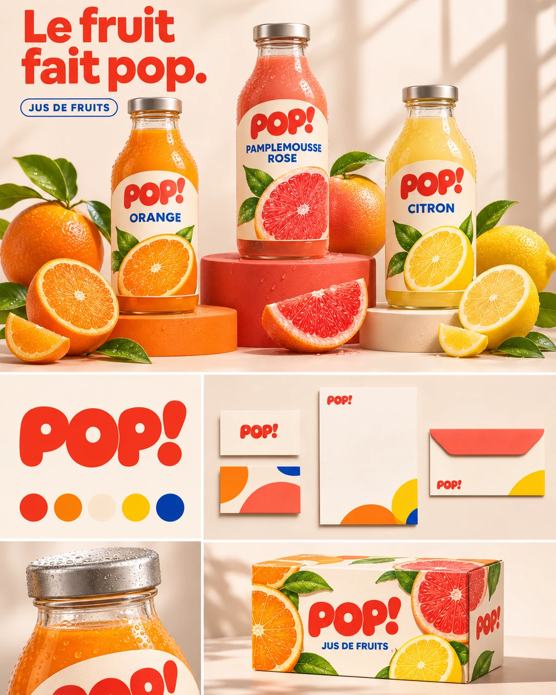
Pop Soda (brand “POP!”) is a range of fruit juices designed to catch the eye on the shelf, on screen and on social media. “Fruit goes pop.”
Context and client
Pop Soda, fruit juice
On a supermarket shelf, a bottle has less than a second to get noticed. The brand had to be legible from afar, joyful and adaptable to each flavour.
The challenge
Keep a single identity while each flavour (orange, pink grapefruit, lemon) has its own colour.
The art direction
A round, bold logotype with an exclamation mark, two-tone labels and a pattern of simple shapes carried onto the website, stationery and boxes. The logotype is built on four principles: thick strokes with soft outlines, closed counters that lighten the red mass, a compact block where the two Ps frame the O, and a slanted exclamation mark that adds movement.
- One colour per flavour
- Logo legible from 3 metres
- Slanted exclamation mark for energy
- Reusable graphic pattern
- Website, box and stationery applications
Colours and typography
The Pop Soda palette, explained.
- POP red
#F23925 - Orange
#F8712C - Lemon
#FFC21A - Cream
#F3DAC6 - Blue
#1D4FB0
Why these colours
Each fruit keeps its natural colour; POP! red ties them together. The cream of the labels softens the whole, and a touch of blue creates contrast.
Typography
A round, very bold display face for the logotype (density, roundness and rhythm), simple capitals for the flavours.
Logo and brand identity
The Pop Soda logo
POP!: a red, round, very bold logotype. Thick strokes with soft outlines, closed counters that lighten the mass, a compact block where the two Ps frame the O, and a slanted exclamation mark that adds movement. Density, roundness and rhythm, legible from afar on the shelf.
All logos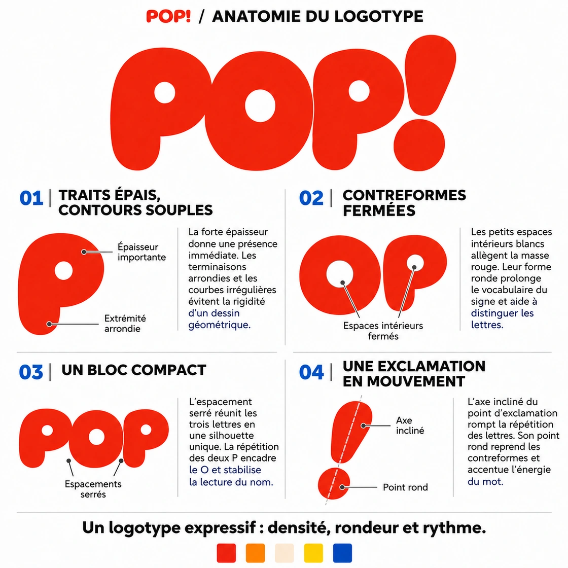
Services
This project involves
Related projects
In the same spirit
FAQ
Beverage brand logo and packaging design: your questions
What budget should I plan for a beverage brand logo and packaging design project?
A brochure site starts at €1,500 excl. VAT, and €2,500 with custom design and full SEO. A full brand guide (logo, colours, typography, usage rules) starts at €1,200. Every item is detailed in a free quote, sent within one working day.
How long does a project like Pop Soda take?
Allow 2–4 weeks for a brochure site, from mock-up approval and receipt of your content.
Do you work across France?
Yes. The studio is based in Bléré (37, Loire Valley): on-site meetings in Bléré, Amboise, Tours, Loches and the Cher valley. Everywhere else in France, projects run by video call to the same standard.
Will I own my website?
Yes, entirely: domain, hosting, code and content are in your name. No lock-in.