Case study · Artisan crisps
Brand creation and packaging for artisan crisps
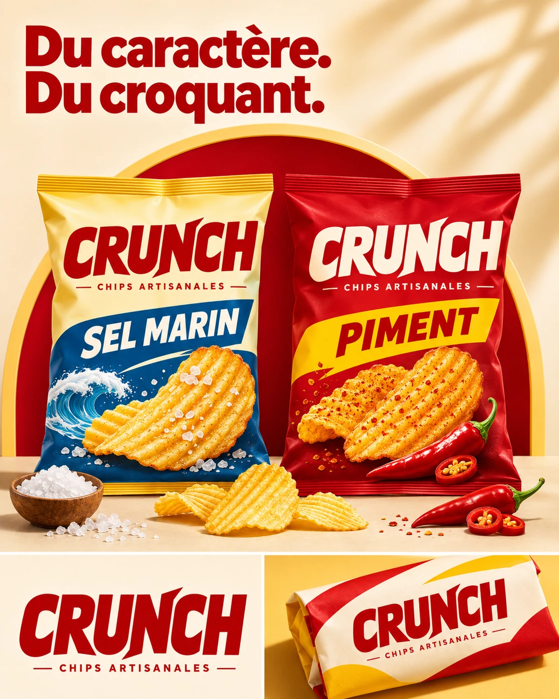
Crunch is an artisan crisps brand: an energetic identity designed for the shelf, social media and short campaigns.
Context and client
Crunch, artisan crisps
Snacks are an impulse buy: the bag must pop on the shelf and make people hungry on a screen.
The challenge
Differentiate each flavour (sea salt, chilli) without losing the unity of the brand.
The art direction
A bold italic logotype that “crunches”, a coloured band per flavour and high-contrast visuals.
- One colour per flavour
- Logo legible from afar
- Social-ready visuals
- Appetising colour code
Colours and typography
The Crunch palette, explained.
- Red
#B50105 - Golden
#F4AD2C - Yellow
#FDD35D - Navy blue
#1C4E9A - Cream
#FAE7C9
Why these colours
Golden yellow recalls the crisp, red brings energy and appetite; blue signs the sea salt flavour, chilli red the spicy version.
Typography
A bold, slanted display face for the logotype, simple capitals for the flavours.
Services
This project involves
Related projects
In the same spirit
FAQ
Food packaging design: your questions
What budget should I plan for a food packaging design project?
A full brand guide (logo, colours, typography, usage rules) starts at €1,200. Every item is detailed in a free quote, sent within one working day.
Do you work across France?
Yes. The studio is based in Bléré (37, Loire Valley): on-site meetings in Bléré, Amboise, Tours, Loches and the Cher valley. Everywhere else in France, projects run by video call to the same standard.