E-commerce
E-commerce UX: 5 pitfalls that drive customers away at the last step
Hidden costs, forced accounts, long forms: five checkout mistakes and how to fix each of them.
 David Mozet · 3 min read
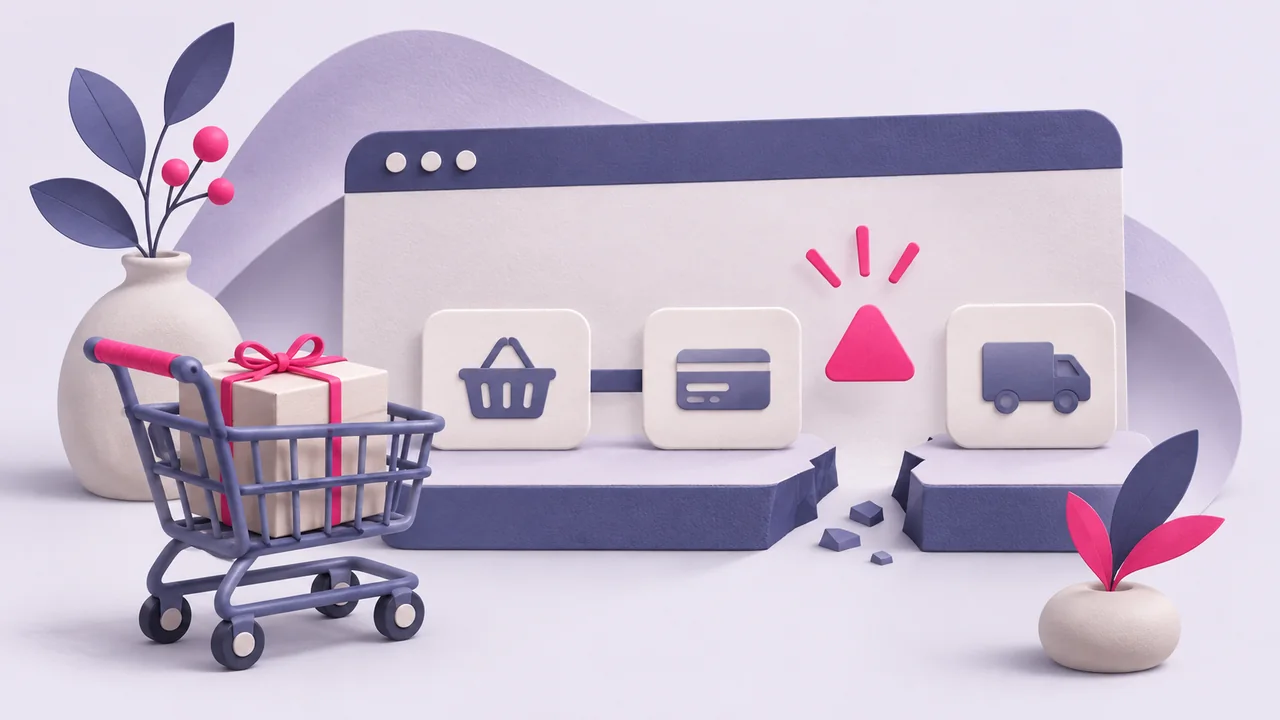
You have attracted qualified traffic, your product pages convert, and yet customers abandon their order at the last step? Do not panic: this affects a majority of e-commerce sites.
At MD-Web Création in Bléré, France, we help online retailers optimise their user experience. Here are the 5 UX mistakes that ruin your conversion rate, and above all how to fix them.
1. Hidden costs
Unexpected extra costs are among the leading causes of cart abandonment (source: Baymard Institute). Shipping, handling fees, taxes: if they are only revealed at the last moment, frustration is guaranteed.
“Be transparent from the product page or the cart: calculate costs in real time to avoid unpleasant surprises.”
Use a dynamic calculator or offer a shipping estimator available before the order is confirmed.
2. Mandatory account creation
Forcing people to create an account before buying is a major obstacle. Shoppers want to buy quickly, not fill in a registration form.
“Offer guest checkout. You can always invite customers to create an account after the purchase.”
You capture the e-mail for the order confirmation, which lets you nurture the customer relationship afterwards without blocking the conversion.
3. Confusing navigation
Changing page to see costs, edit an address or go back to the cart: if users get lost, they give up.
“Simplify your checkout into a single page, clear and free of distraction.”
Adopt linear navigation with no unnecessary back-and-forth. The design should guide the user naturally, step by step.
4. Endless forms
Surname, first name, title, date of birth, phone, company: is all of that really necessary? The longer a form, the more it discourages.
“Ask only for what is strictly needed to deliver and invoice.”
Group fields, use autocomplete and remove non-essential information. A smooth process makes all the difference.
5. Lack of reassurance
Is it secure? Where are the reviews? Can customer service be reached? A user with no answer to these questions does not confirm the order.
“Highlight security badges, contact options and customer reviews from the cart onwards.”
Add visible, credible reassurance at each step, without overloading the interface.
Conclusion
Checkout is a critical moment where the slightest friction can derail everything. By fixing these 5 common pitfalls, you significantly improve your chances of conversion.
Need a UX audit of your checkout? MD-Web Création helps you grow your online sales.